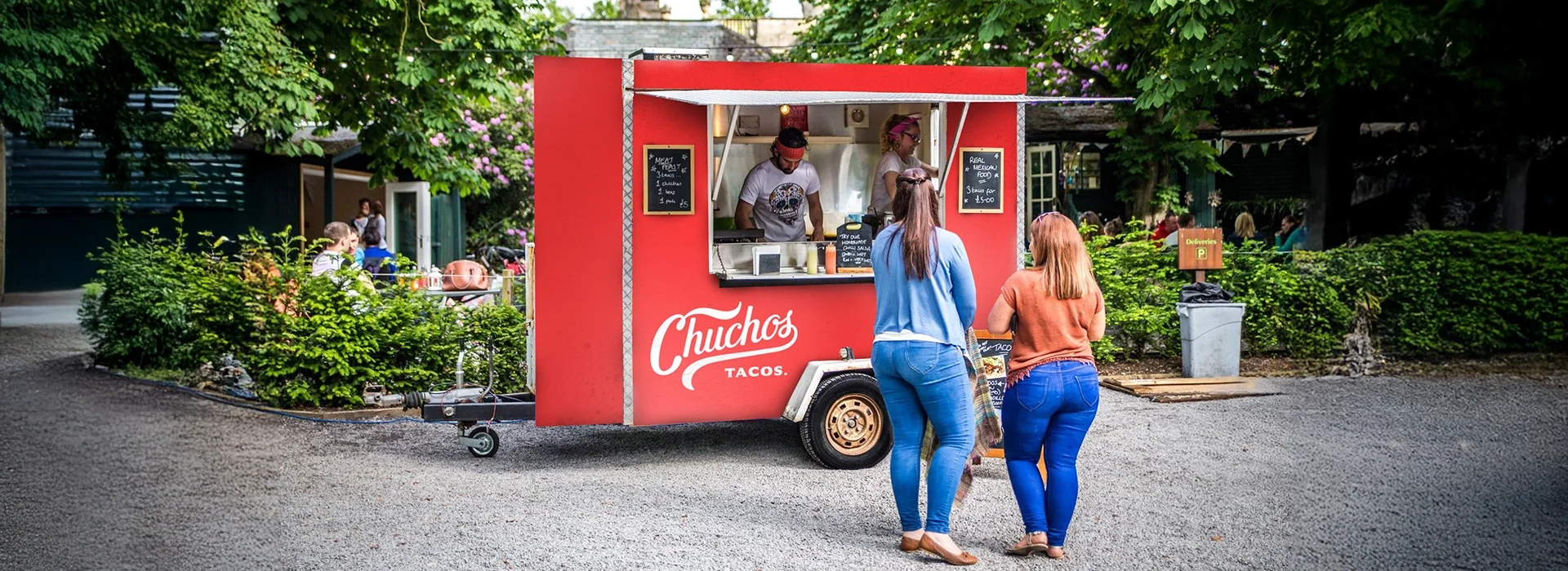
Real Mexican Food
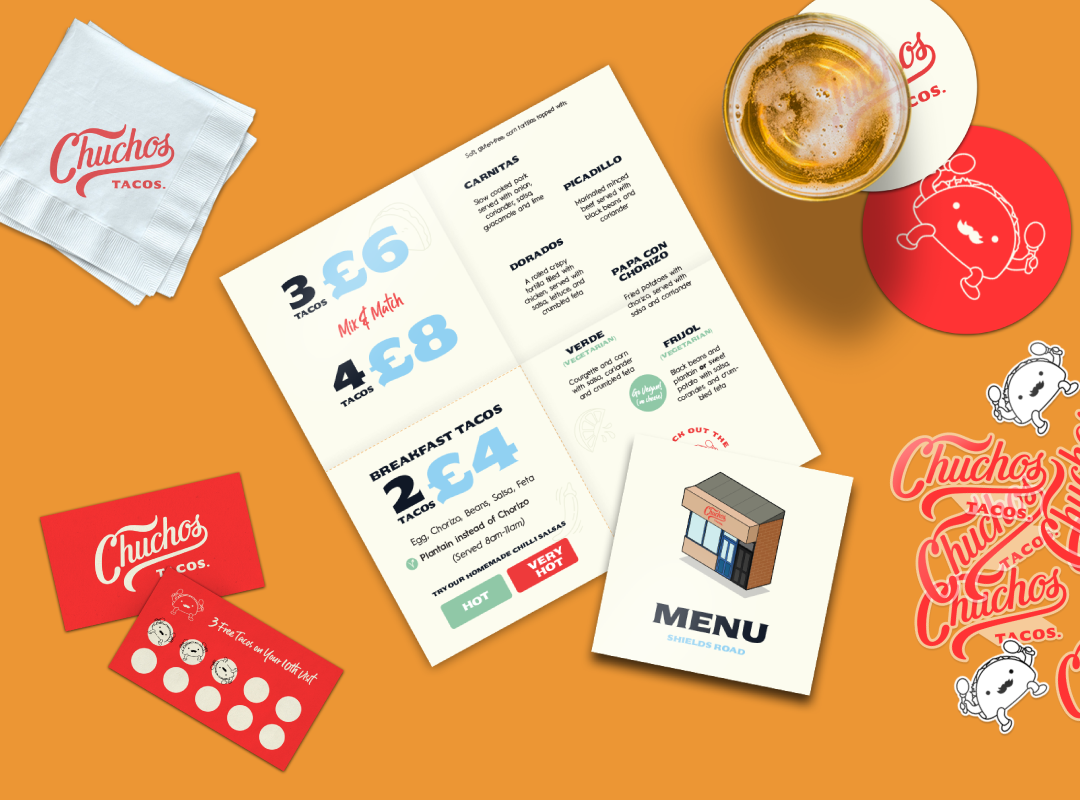
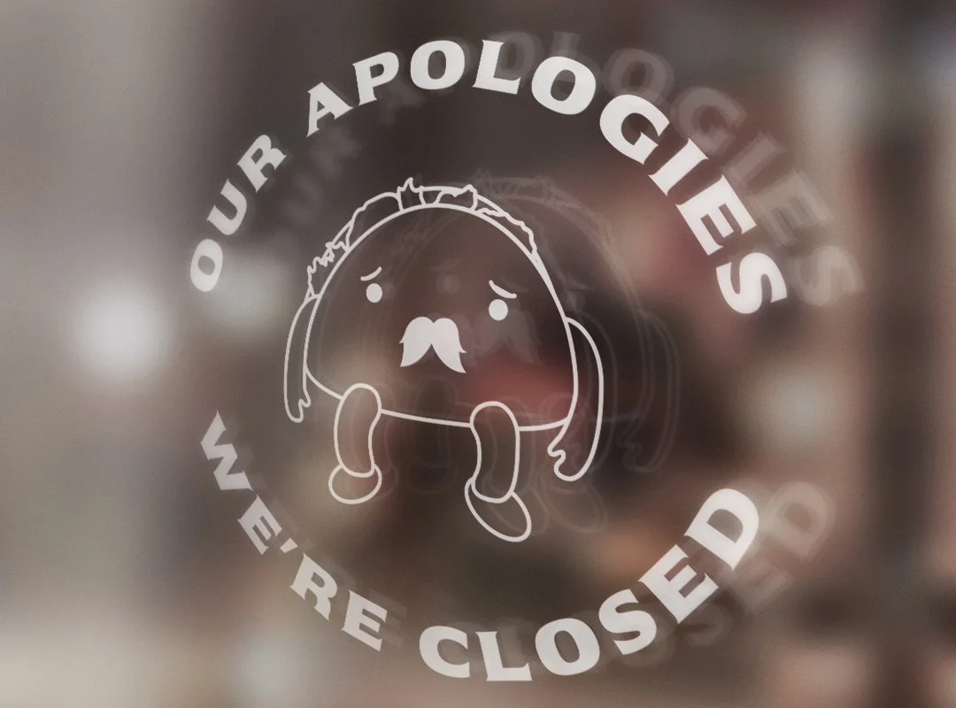
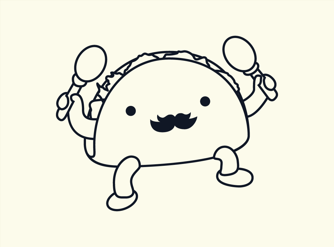
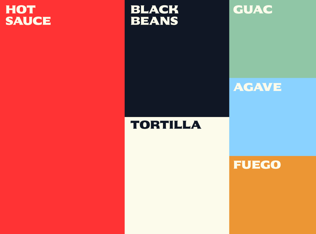
The Chucho’s Tacos rebrand celebrates a fresh chapter for the business, one that’s rooted in authenticity, energy, and the joy of great food. Every element, from the new logo to the color palette and the introduction of a brand mascot, has been designed to capture the true spirit of a lively taquería while setting the brand up for the future.


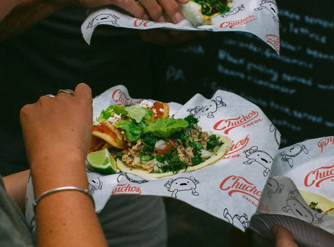

Inspired by the hand-painted signage of traditional Mexican taquerías. The custom script lettering captures warmth, authenticity, and movement, giving a nod to heritage while feeling fresh and contemporary.
Careful attention to letter spacing and smooth stroke transitions ensure the logo remains readable and balanced whether displayed on a storefront sign, menu header, or small packaging label.
The Logo
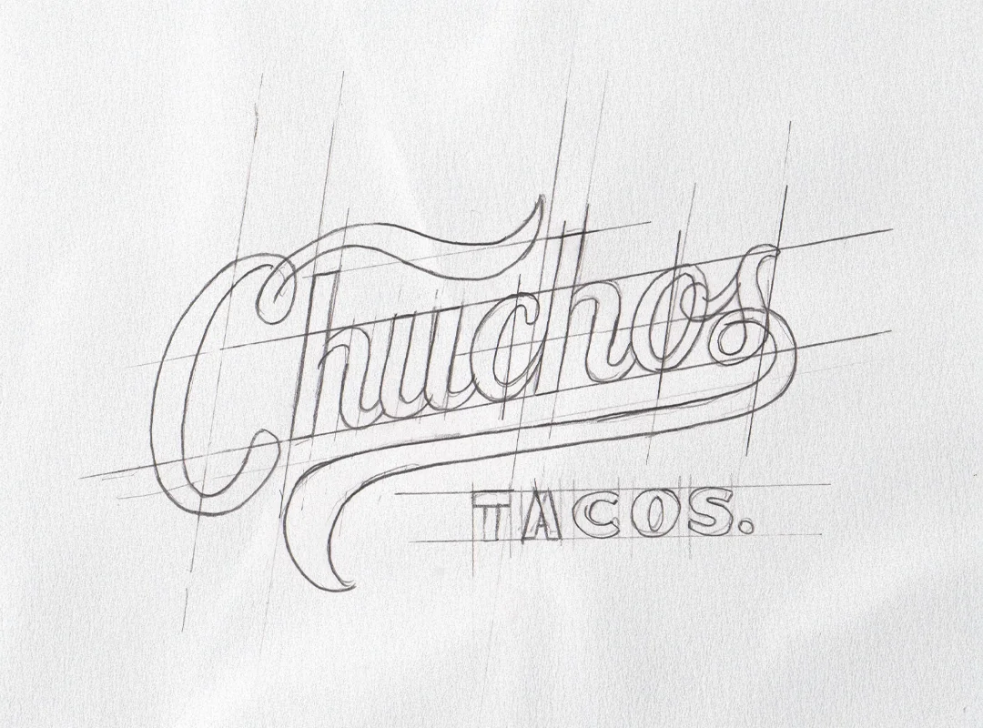
Unlike the previous logo, which relied on illustrative elements, the new mark uses typography and simplicity to create an instantly recognizable wordmark.
Applied across merch, menus, and signage, this logo will stand out with confidence, giving Chucho’s Tacos a cohesive and memorable visual identity that feels both rooted in tradition and ready for the future.


