a New Zealand–based coffee roaster and café doing seriously good coffee. From everyday staples to more experimental roasts, they’ve built a strong following around quality and craft. As the business continued to grow, it became clear that the original branding wasn’t quite keeping up—it wasn’t designed to scale or flex across everything the brand was becoming.
Flight Coffee
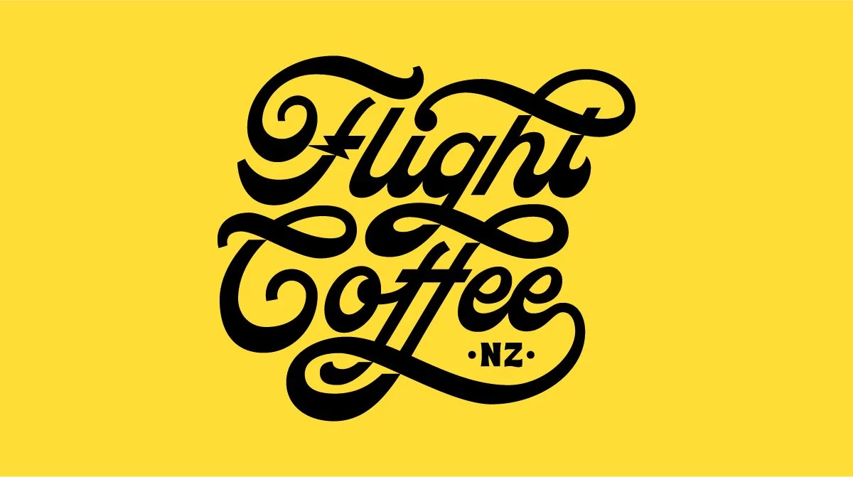
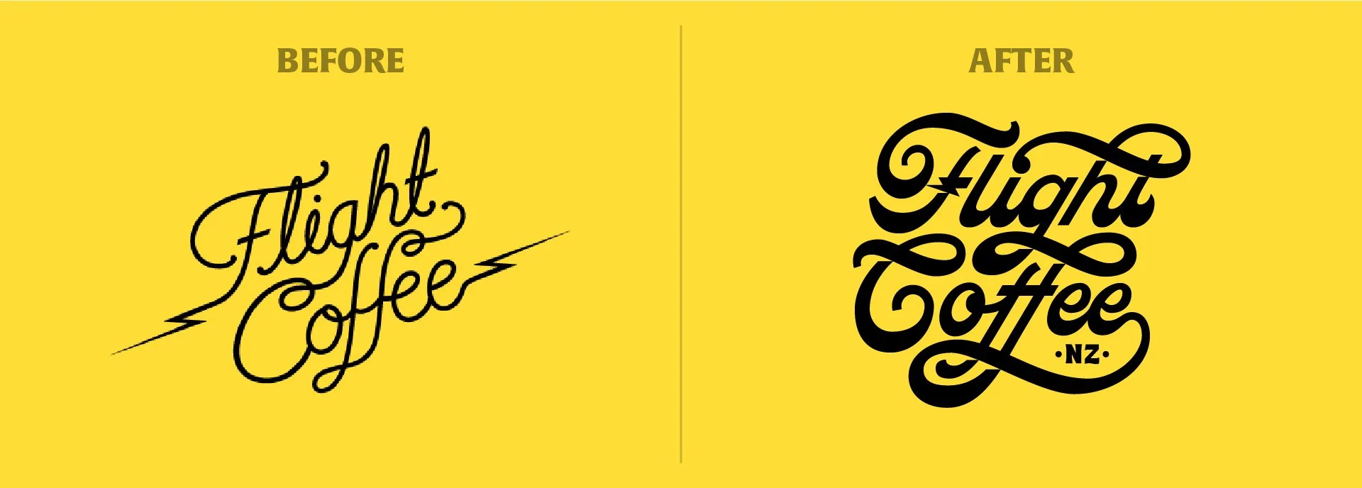
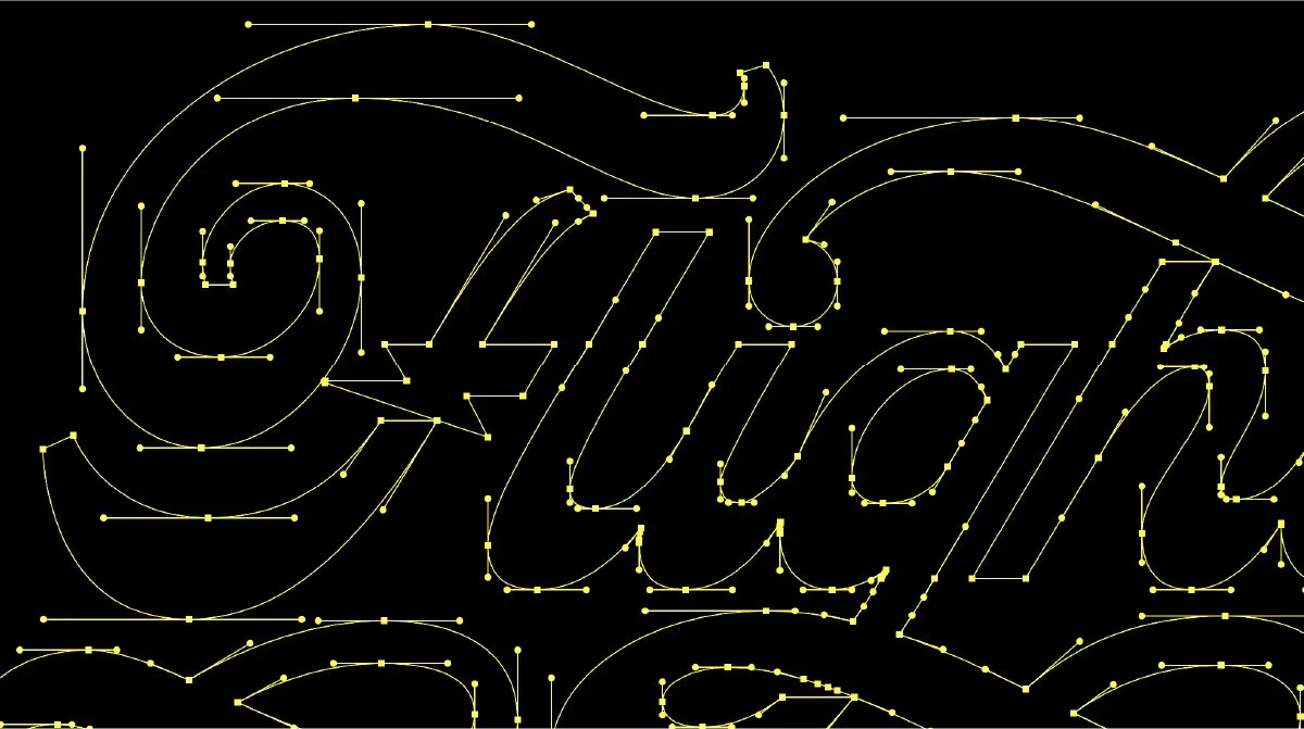
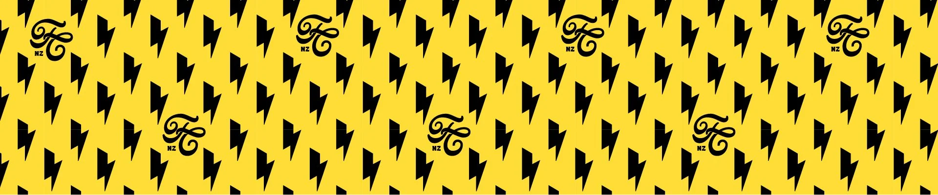
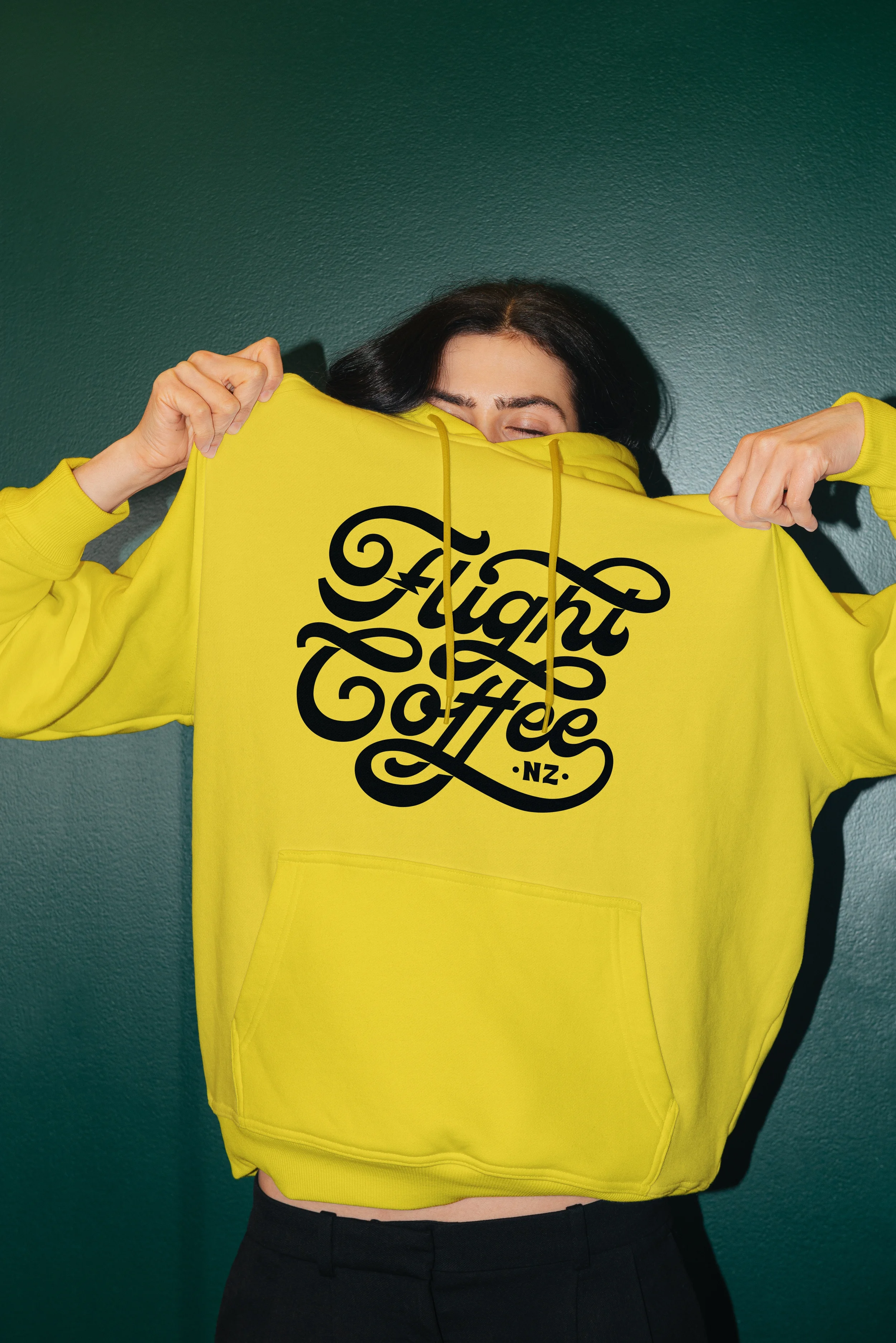
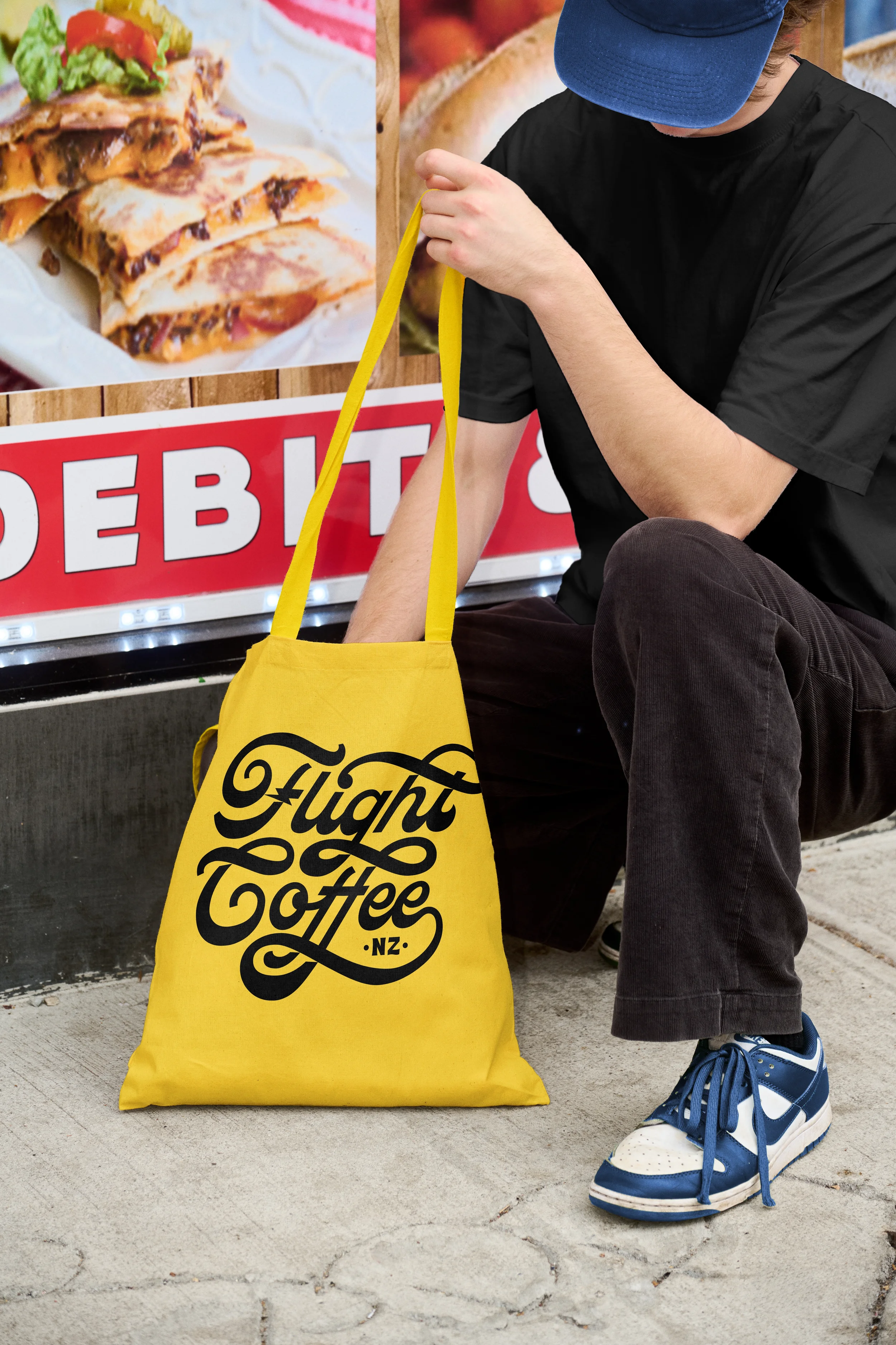
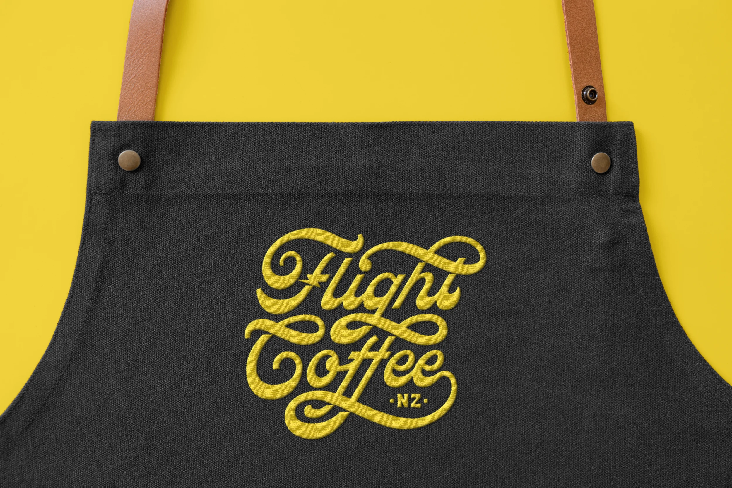
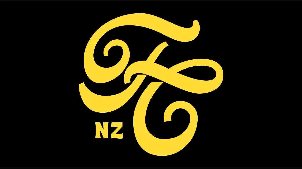
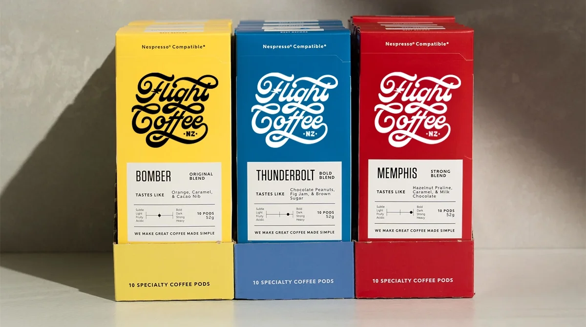
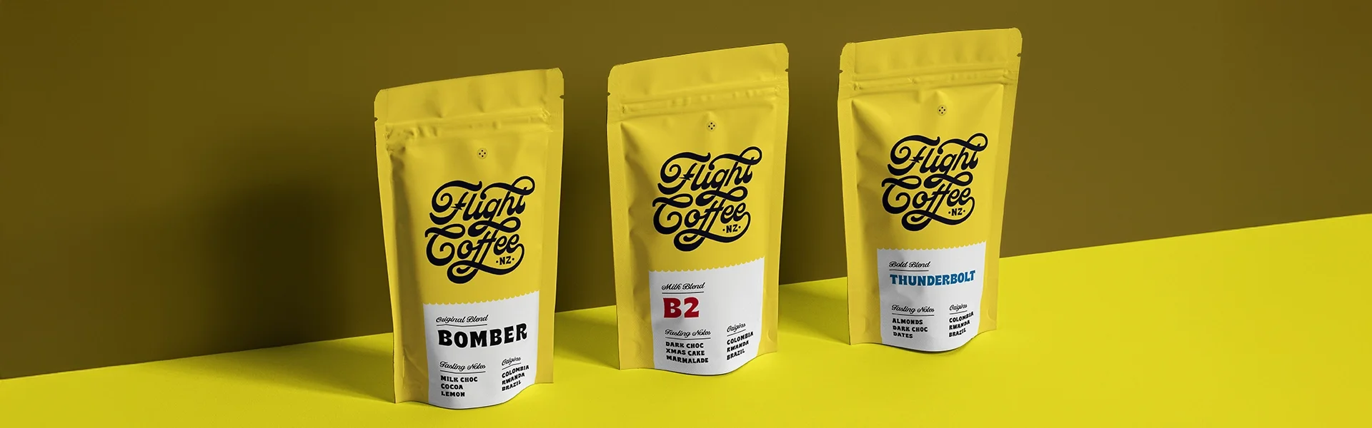
The new logo brings a lot more confidence and structure while still keeping things fun and expressive. It’s bold, easy to recognise, and works way better across packaging, merch, signage, and digital use. The typography feels more intentional and balanced, giving the brand a stronger presence without losing its personality. The lightning bolt was kept as a key element too, since it already had strong brand recognition, just refined and better integrated so it feels like a natural part of a brand that’s ready to grow.