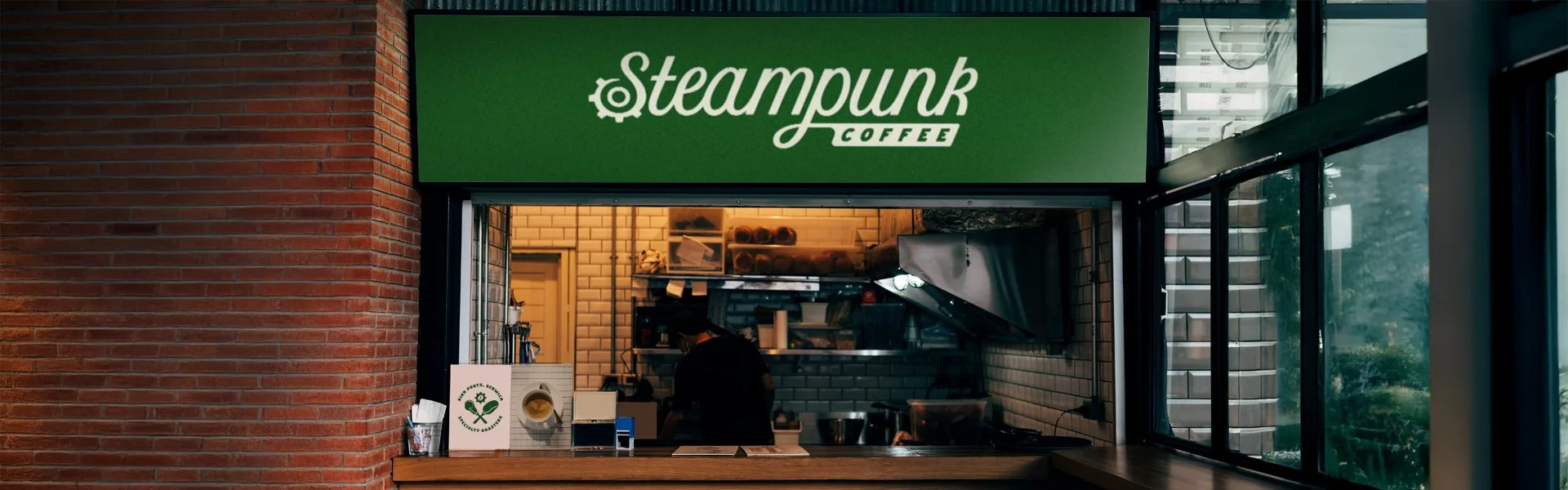
Steampunk Coffee
Tucked away on the Scottish border of Berwick is a specialty coffee shop and roastery that has long been a community favourite. Known for their craft-driven approach, small-batch roasting, and deep love of coffee culture, Steampunk has built a reputation not just for exceptional brews, but for the warmth and character that define their space.
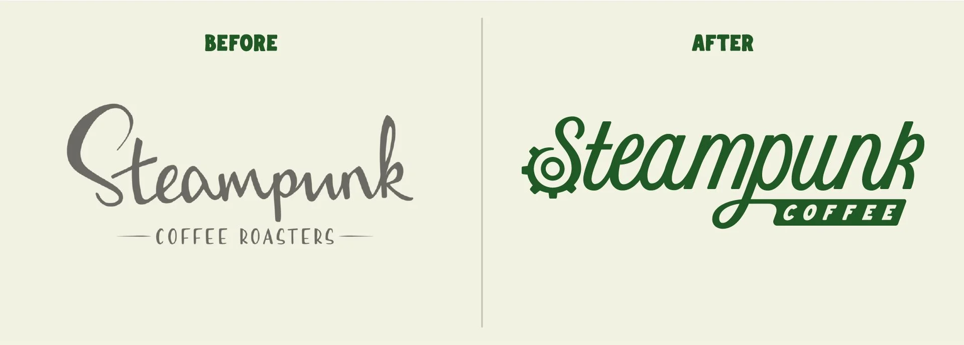
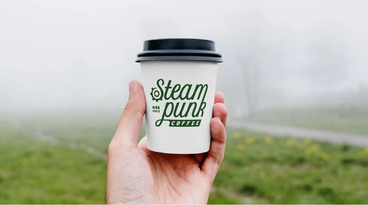
As Steampunk continues to evolve, their branding didn’t quite keep pace. The original identity, beloved but limited, struggled to stretch across the growing demands of modern packaging, digital platforms, and expanding product lines. It lacked versatility, consistency, and the boldness that now defined their craft. Steampunk needed a visual system that could grow with them, something modern yet familiar, fresh but still true to the charm their community knew and loved.
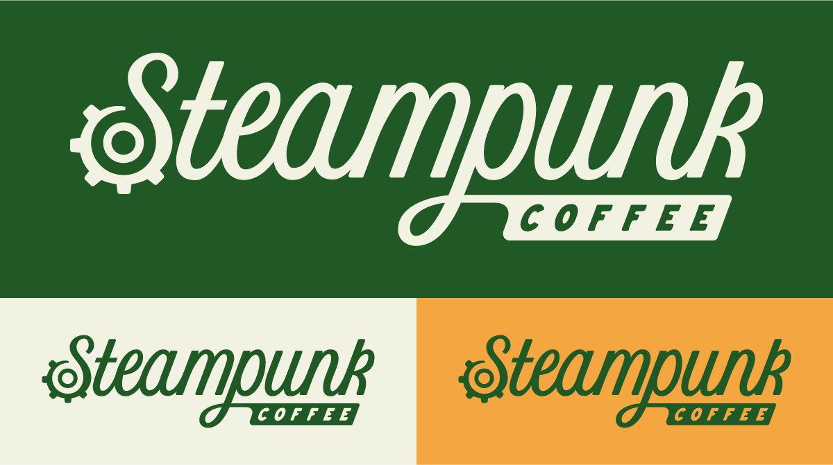
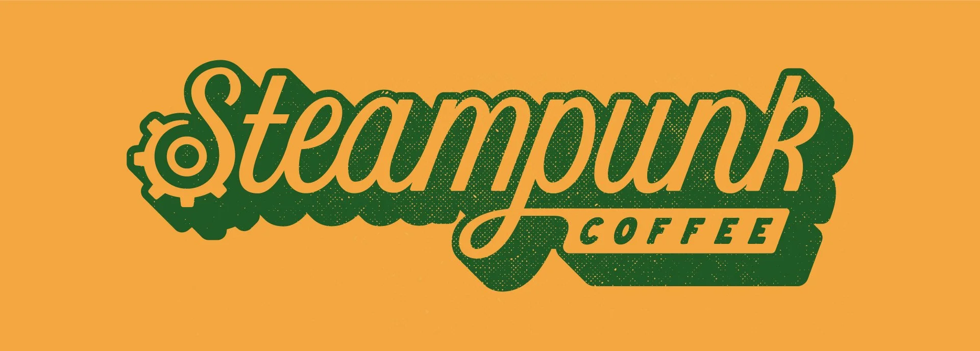
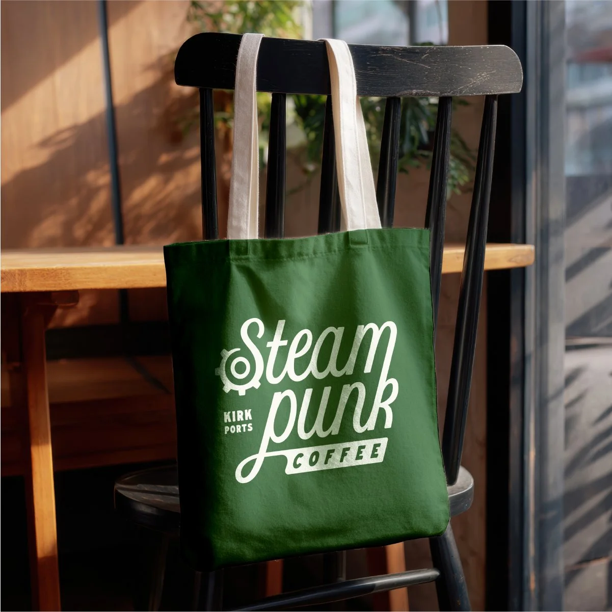
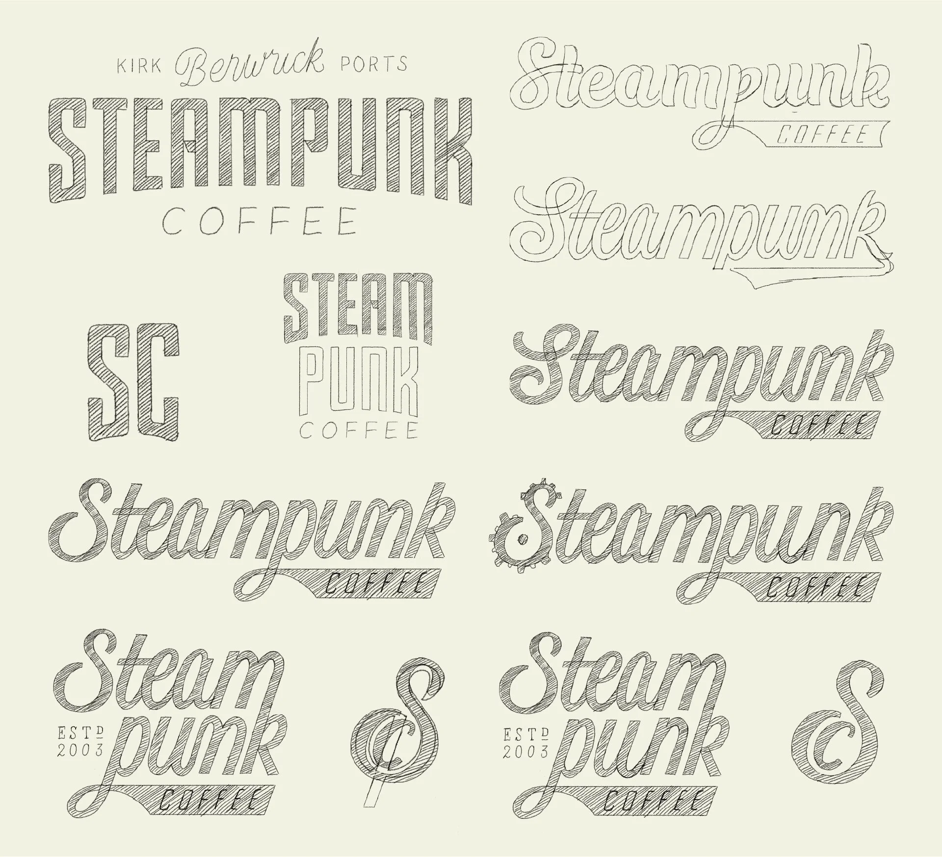
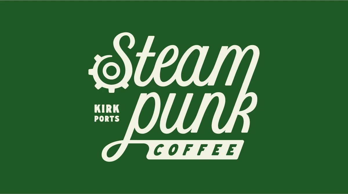
I rebranded Steampunk with a modernised yet character-rich visual system built to honour their roots while preparing them for the future. I designed a suite of responsive logo marks and icons that adapt seamlessly across packaging, merch, and digital spaces. A refreshed colour palette and typographic system strike the balance between warmth, heritage, and contemporary edge. The brand rollout extended into updated packaging, cleverly utilising existing materials to reflect Steampunk’s commitment to sustainability. The result is a cohesive, flexible identity that strengthens the brand’s presence, celebrates its craft, and preserves the unmistakable personality the community holds dear.