
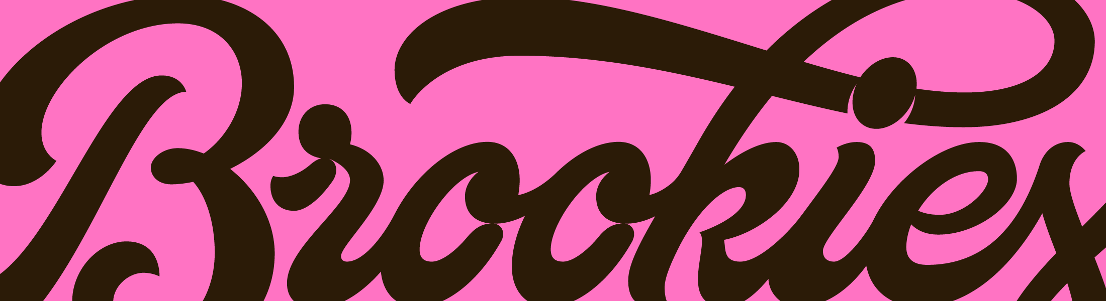
Brookies was imagined as the kind of bakery people go out of their way for. The sort of place where oversized cookies sit behind the counter, fresh batches come out throughout the day and signature pink boxes become part of the experience. The identity was created to capture that feeling of anticipation, turning a simple sweet treat into a brand that feels indulgent, memorable and impossible to walk past.
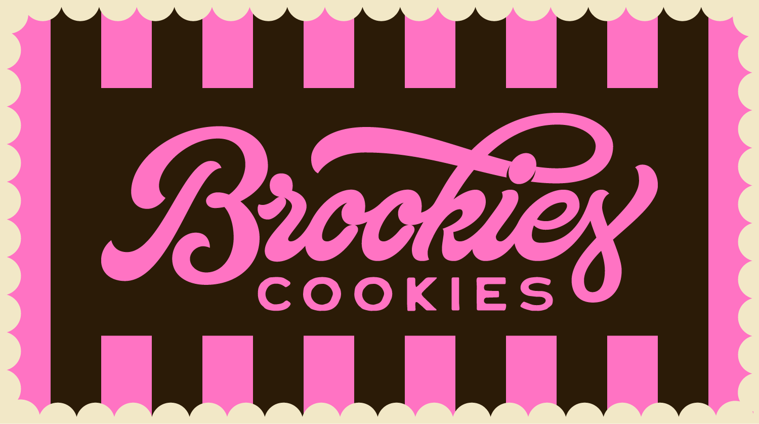
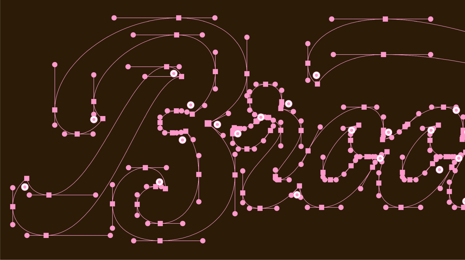
Rich chocolate tones, playful pinks and vintage-inspired stripes create a world that feels both premium, nostalgic and unapologetically fun. The flowing script wordmark brings warmth and personality, while the supporting typography makes everything feel hand-made. The result feels distinctive enough to stop shoppers in their tracks, yet familiar enough to feel like an instant favourite.
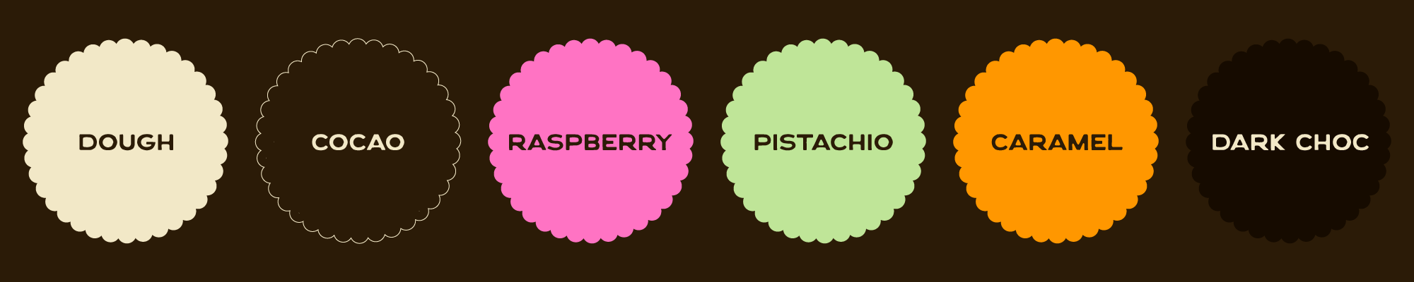
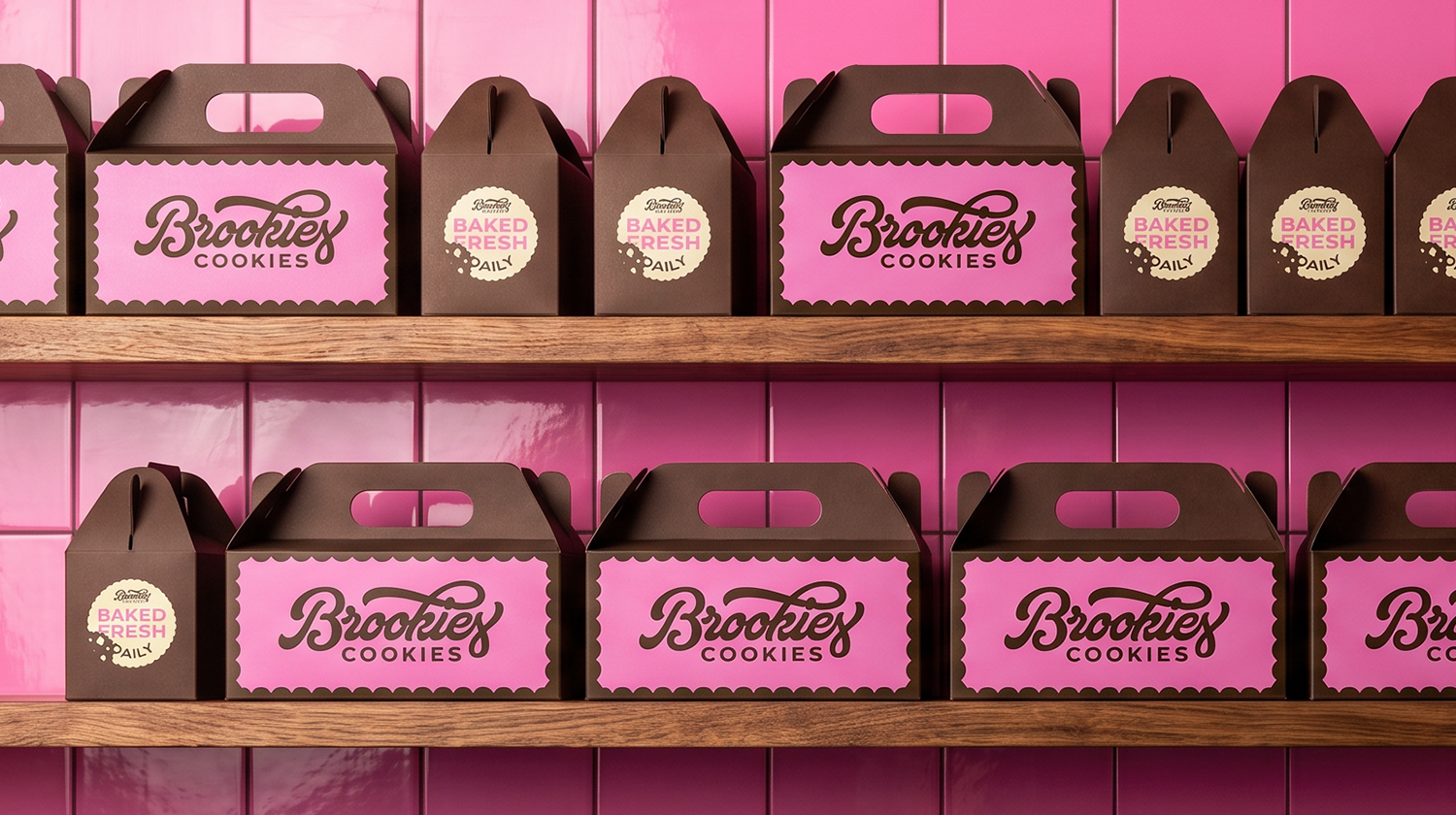
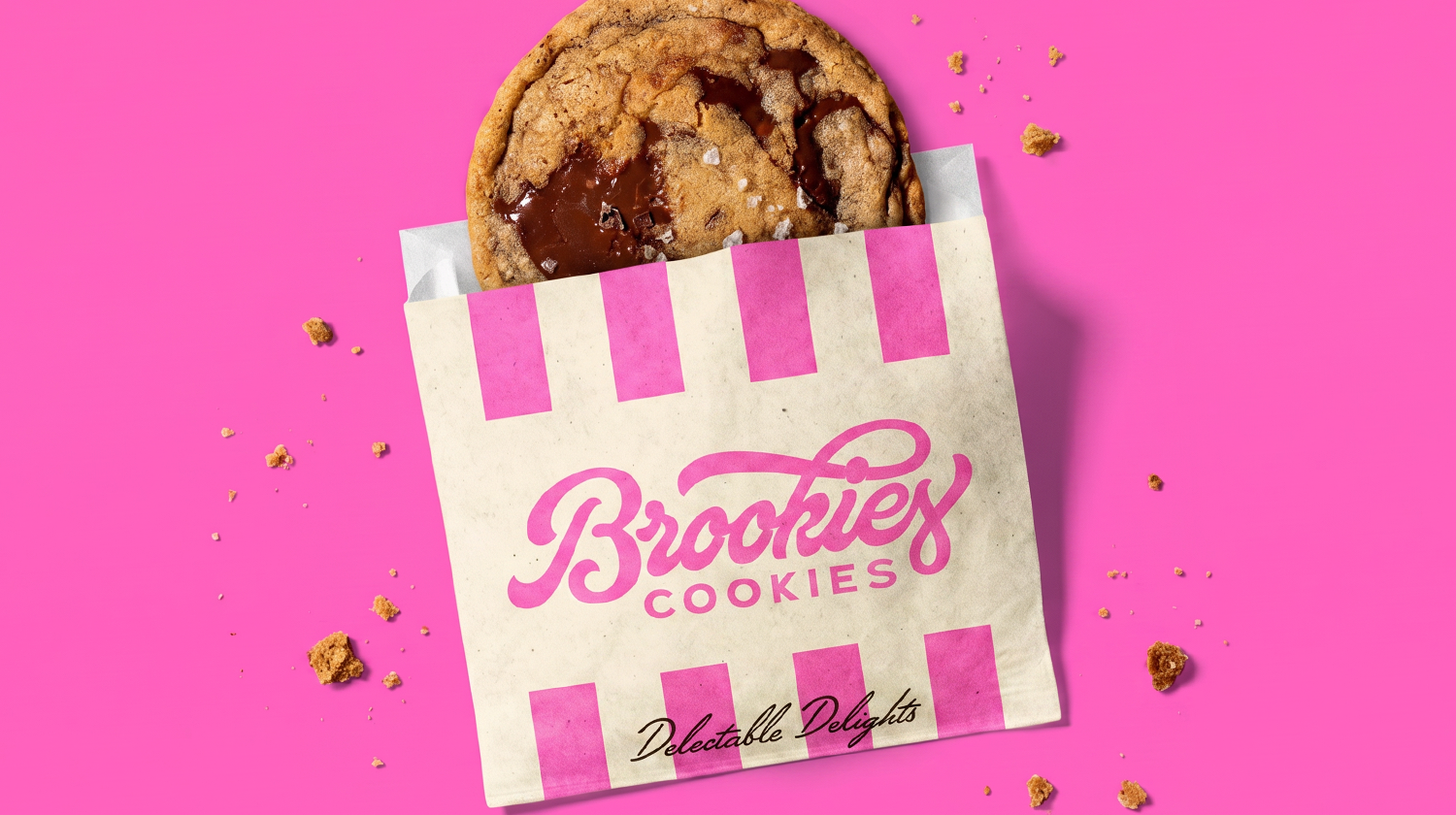
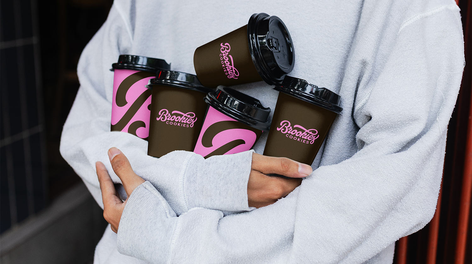
Every element of the brand was designed as part of a flexible system that could grow naturally across multiple touchpoints. From takeaway bags to gift boxes, coffee cups and retail-ready products, the identity remains consistent while allowing individual collections and seasonal moments to shine. Playful graphics, repeat patterns and colour variations give the brand depth without overwhelming the core identity.

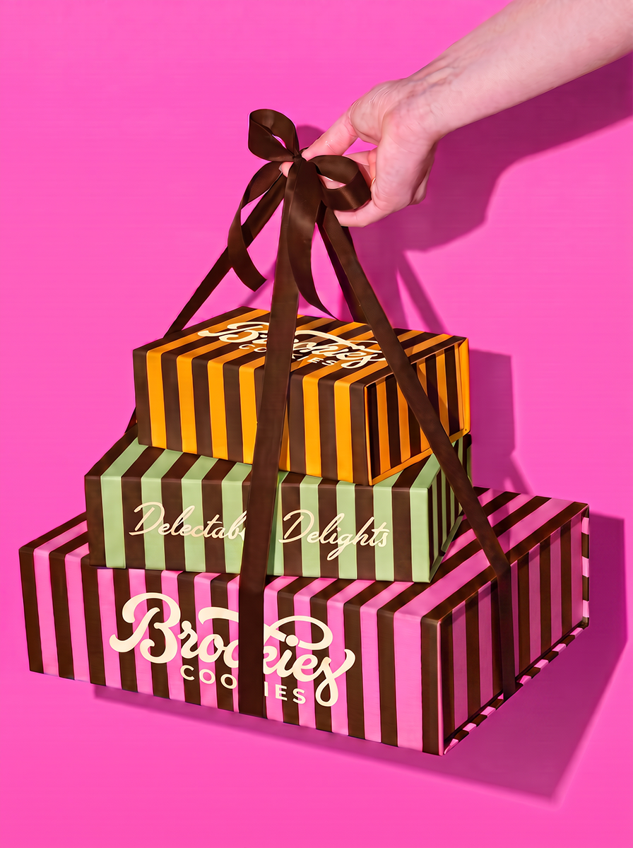
Packaging became the centrepiece of the brand. Inspired by traditional confectionery boxes, the striped designs turn gift-boxes into a special experience.
Whether stacked on shelves, carried through the high street or displayed behind the counter, the range is designed to feel bold, premium and instantly recognisable.
The result is a visual identity that celebrates everyday indulgence while giving Brookies the confidence to live comfortably both in its own bakery and on retail shelves.